Imogen Todd

Berlin Wall Data Visualization

A site built with D3 for the final project of The New School's Infographics and Visual Storytelling class, Fall 2021. The live site can be found here. (It works best on desktop.)

New School certificate

data viz

web development

a histogram showing number of deaths at the berlin wal per year, in black and white

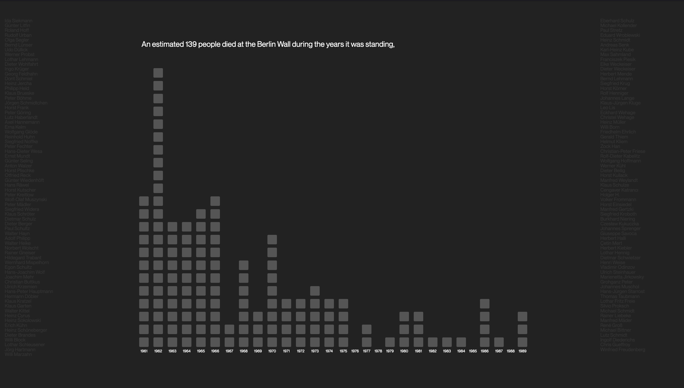
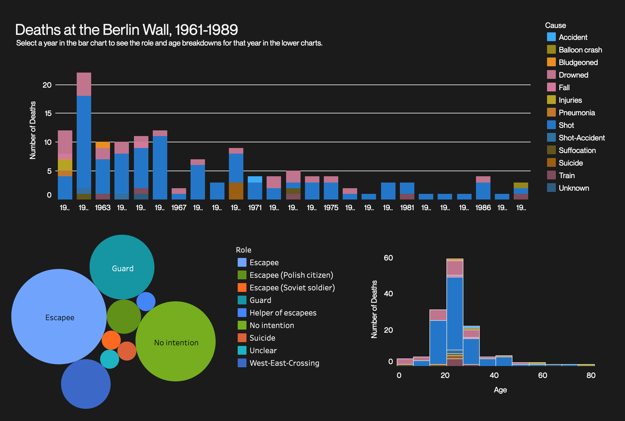
The first graph on the page

a visualization showing colored squares to represent each death at the wall. The names of people who died are listed in color to the left and right of the squares.

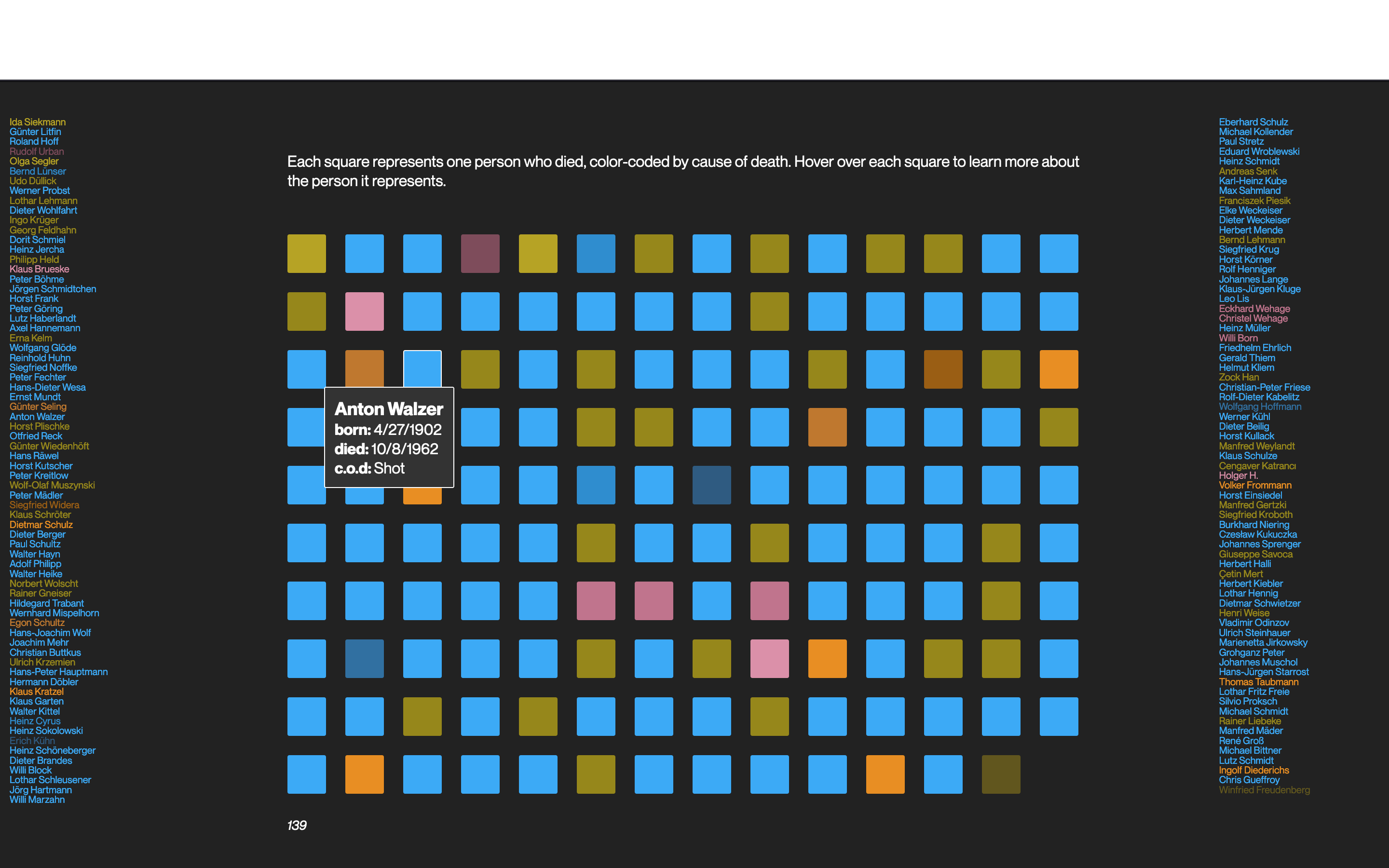
Hovering over a square

a second visualization showing individual deaths as colored squares broken up by cause of death.

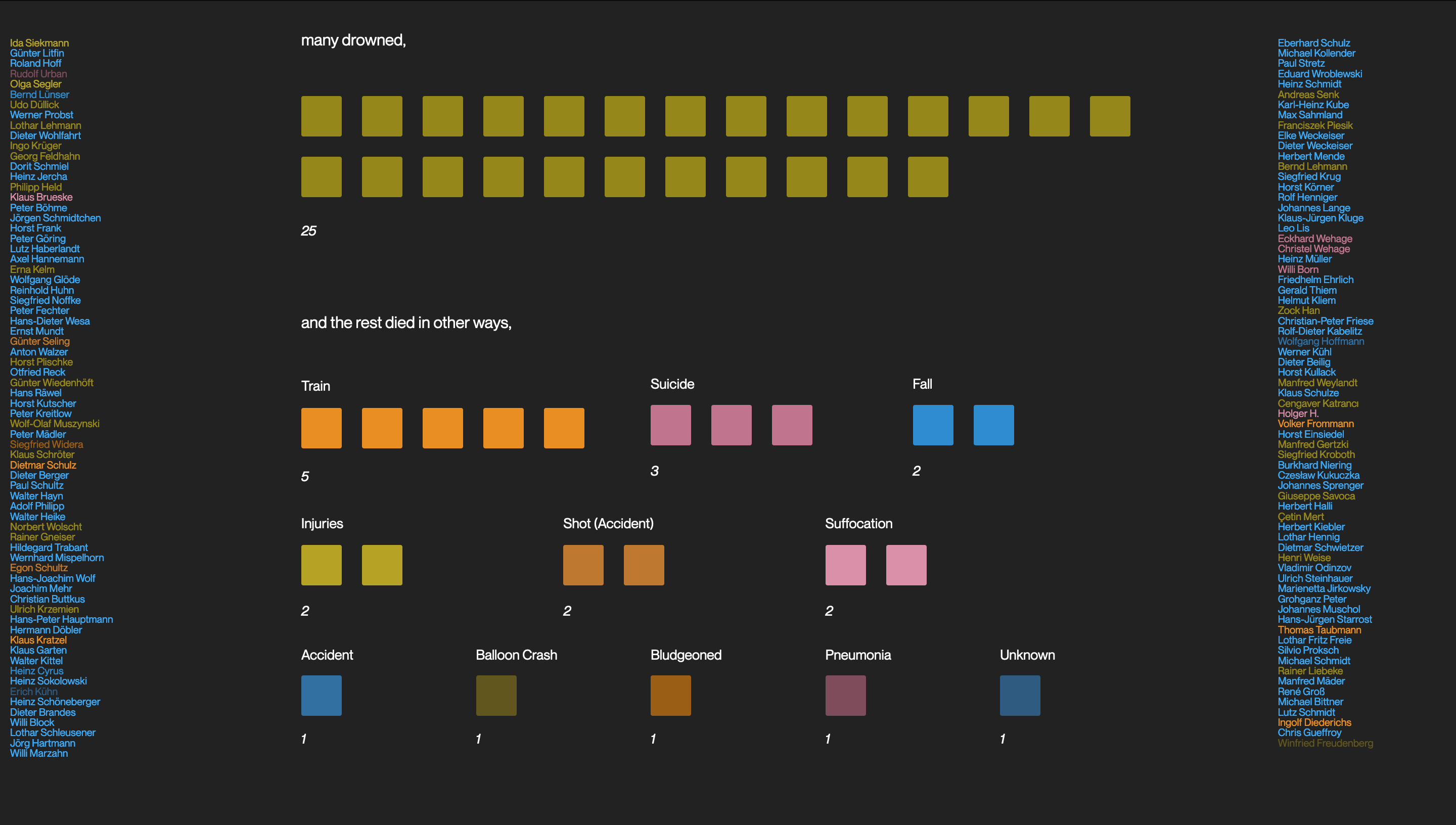
Squares split up by cause of death

a visualization showing deaths at the Berlin wall from 1961-1989 by month and year.

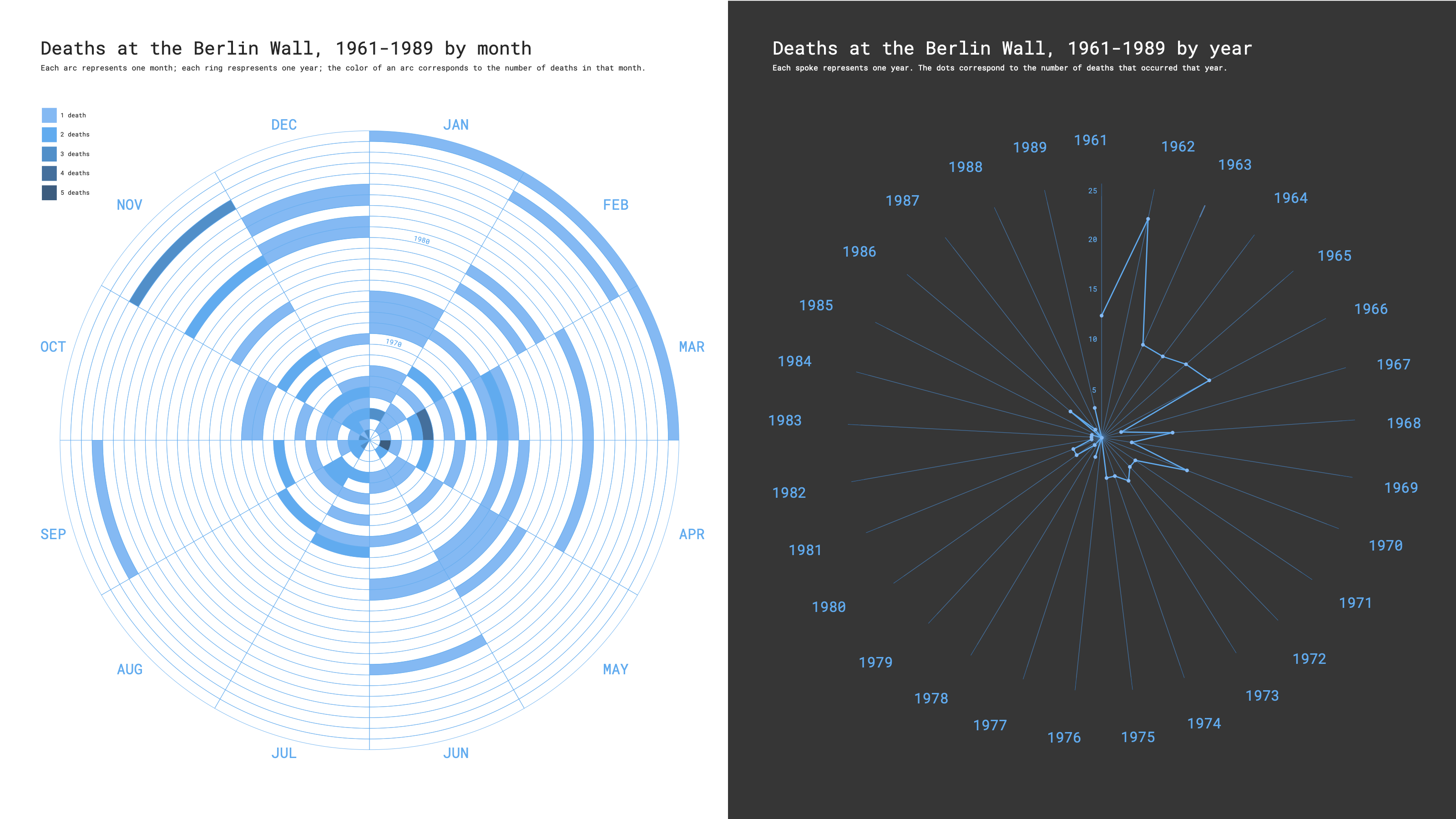
An early iteration of the visualization

a Tableau dashboard showing deaths at the Berlin wall from 1961-1989 broken up by year, cause of death, and role played in the incident that caused the death.

Another early iteration of the visualization