Data Visualization Explorations
Miscellaneous explorations in bringing data to life visually using D3.js and other tools.
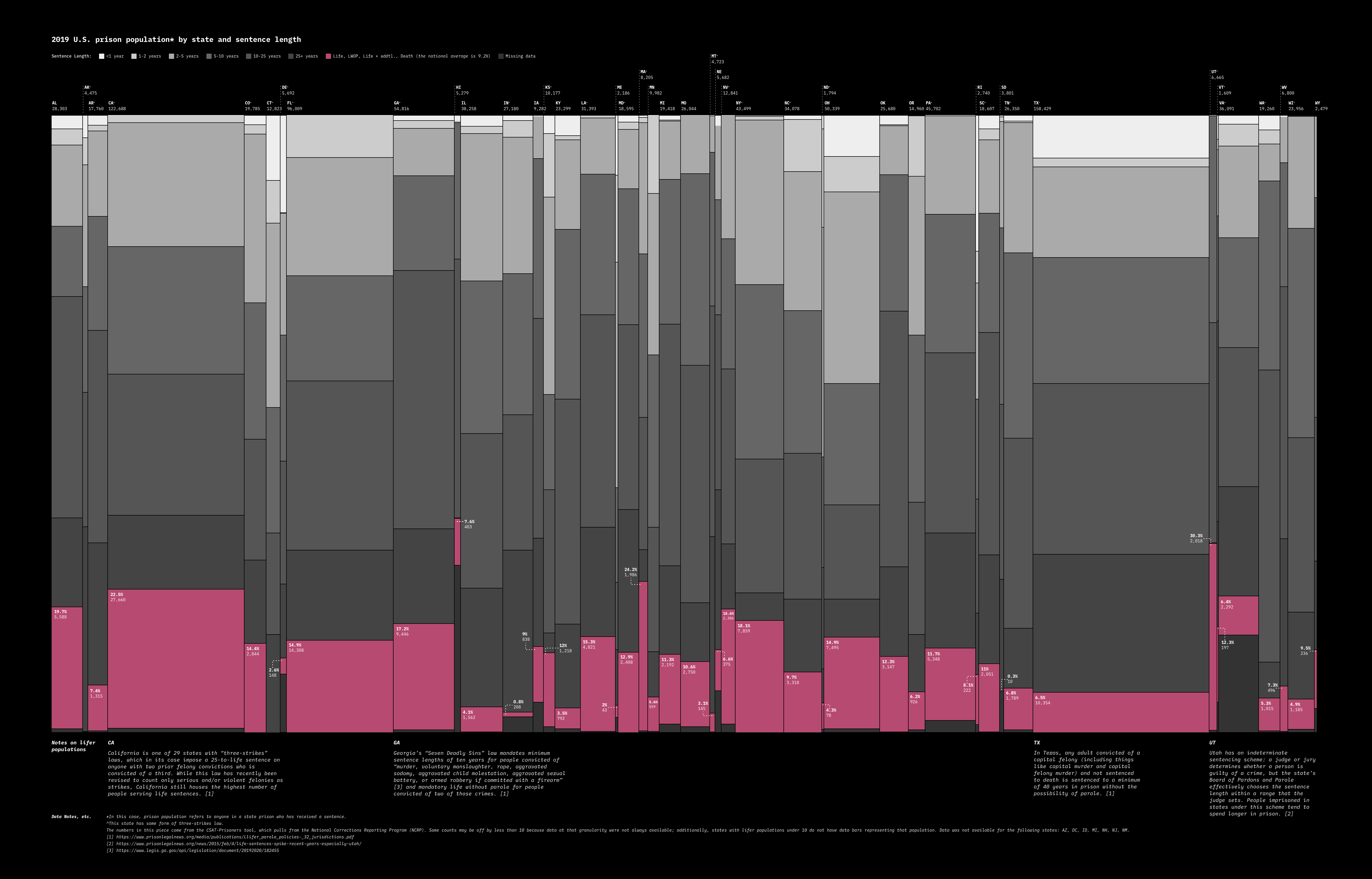
A marimekko chart, started in D3 and refined by hand, showing prison population by state and sentence length, highlighting the "lifers" in each state
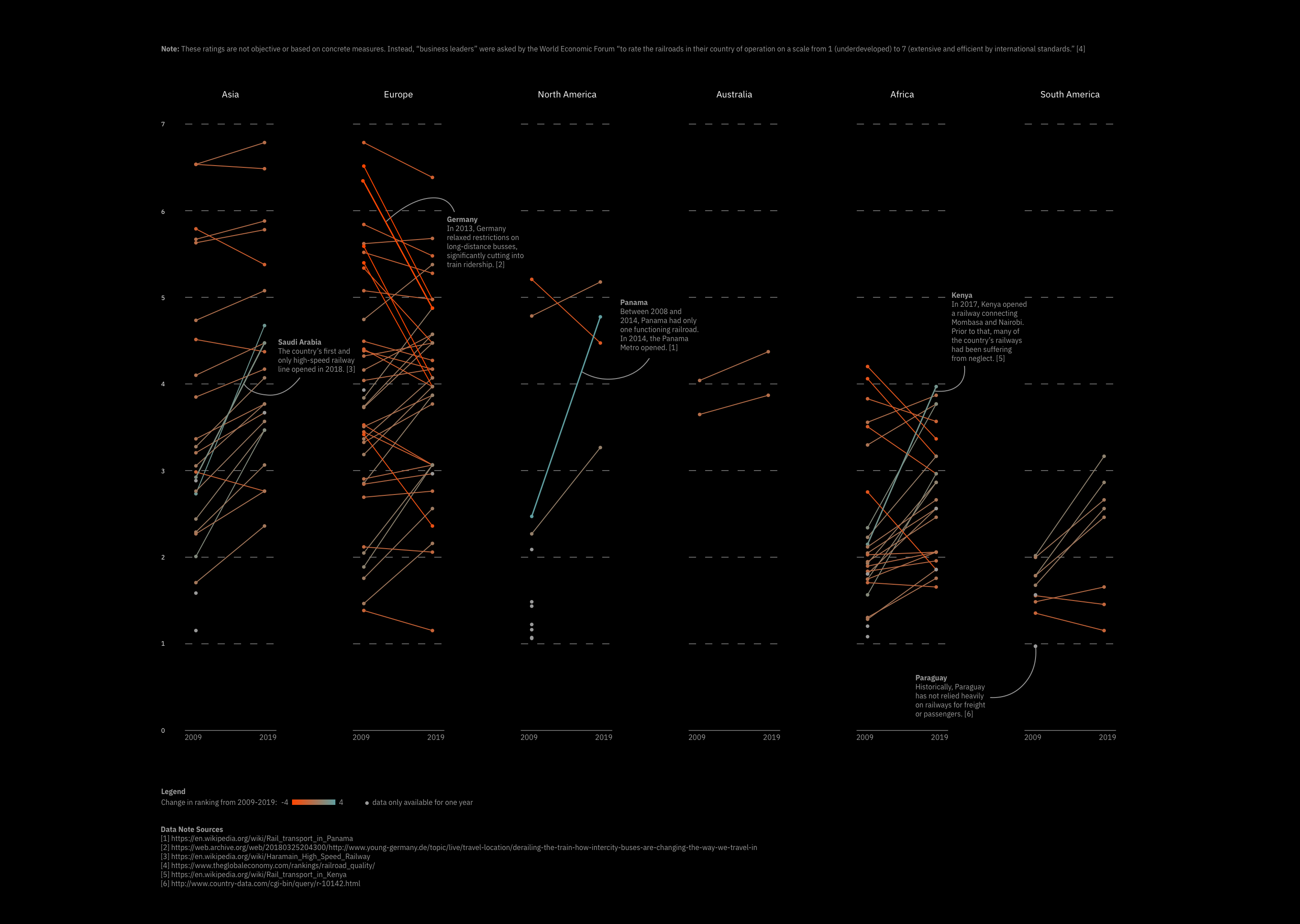
A visualization using parallel plot small multiples to explore differences in railroad infrastructure quality for different countries and another version focusing more on trends across continents instead of individual countries.
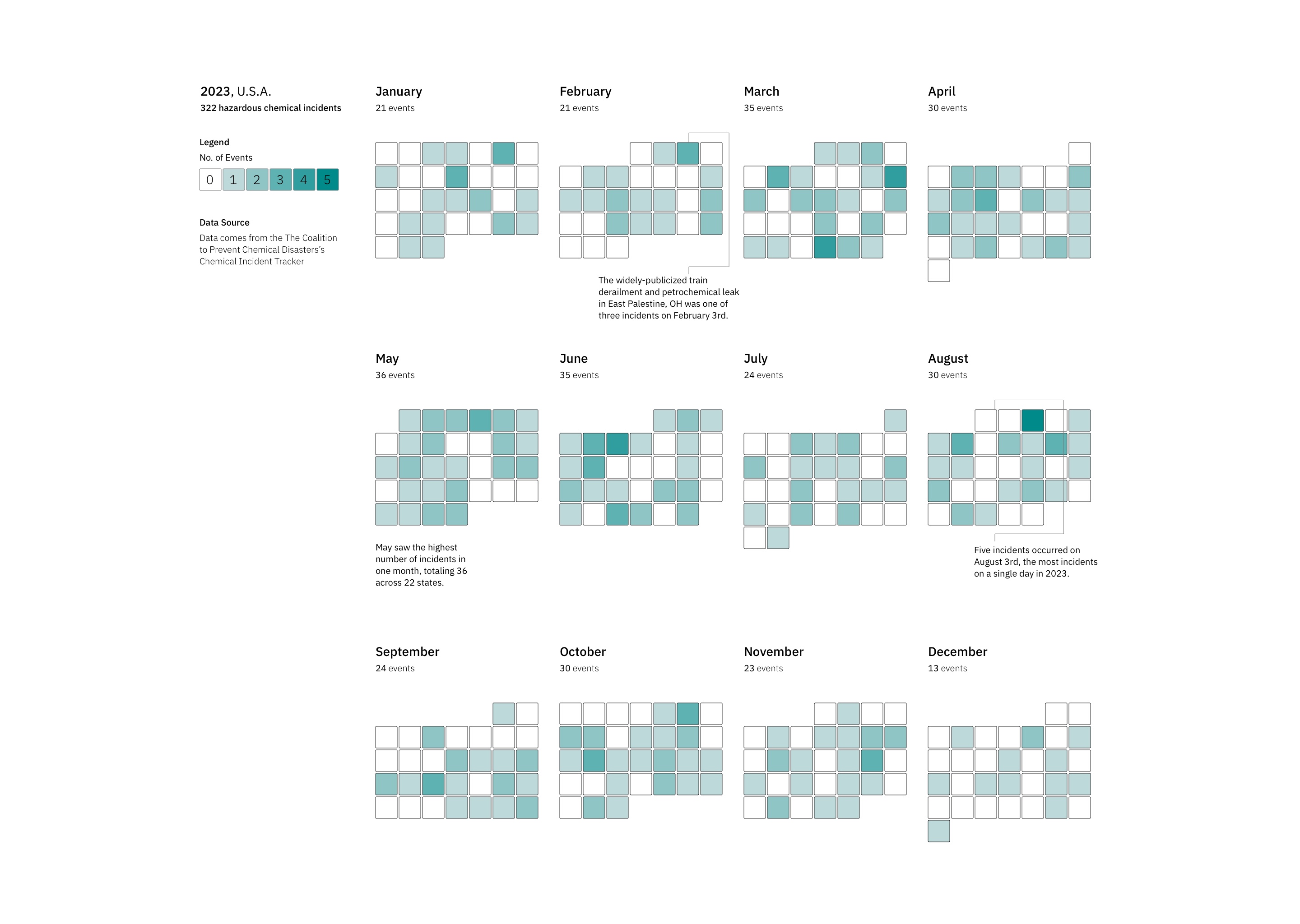
A heatmap showing chemical disasters that occurred in the USA in 2023.
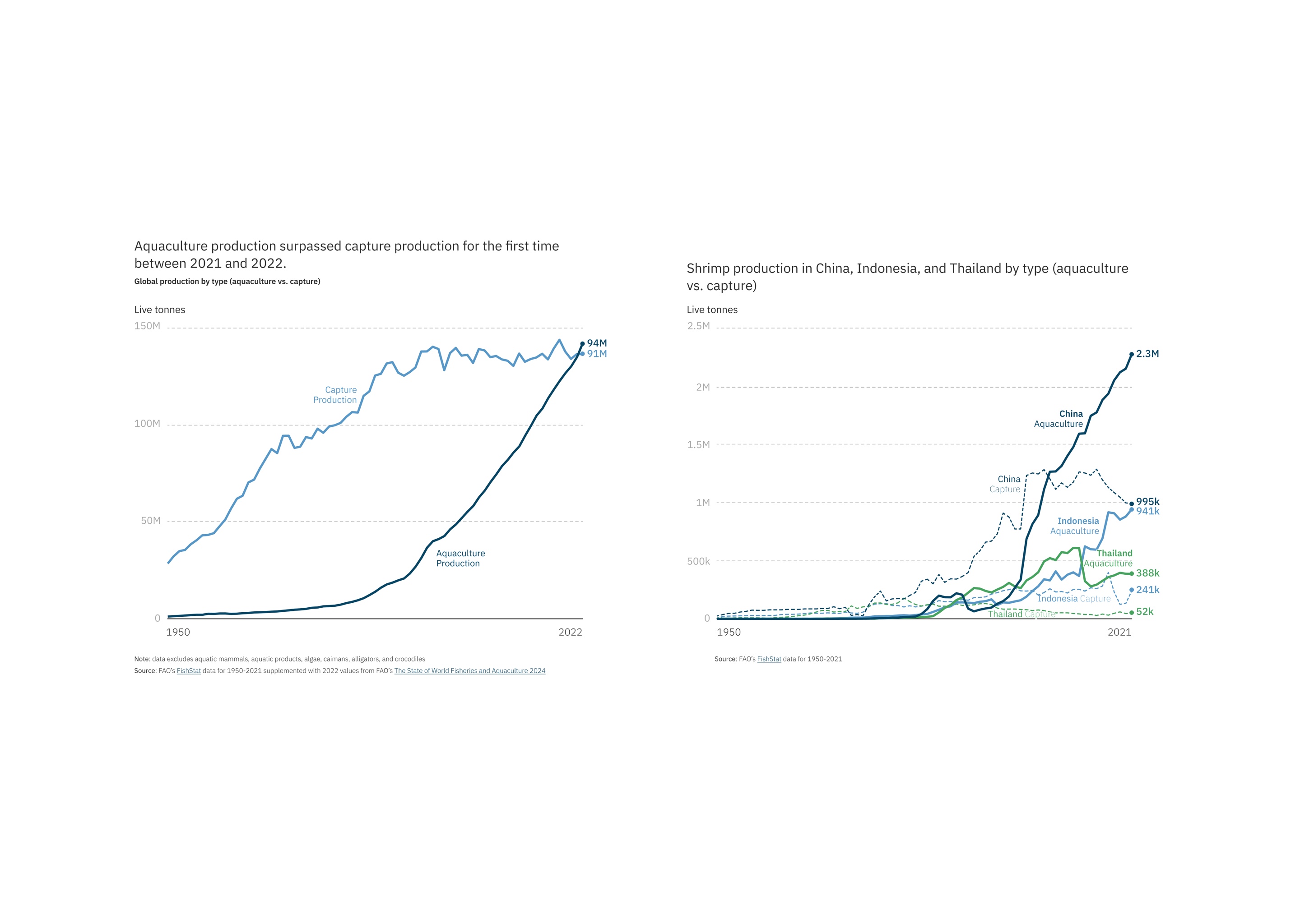
Line charts showing how production of fish and shrimp has skyrocketed in recent years.